It takes a lot to put together a website that’s aesthetic as well as designed to deliver a function effectively. It’s a job for professionals trained especially in the principles of effective interaction and communication design.
A not-so-good website isn’t just one that’s not “good looking” or on-trend as far as UI/UX design goes. It is also one that doesn’t work well as a piece of communication as a whole, to meet a need. When adjudging good design, it’s important to ask: does the writing convey a message, inspire an action, deliver a service? Are the visuals in sync with the brand’s messaging and personality? Is the information hierarchically organised? Without giving these elements due thought and importance, a website can be so poor it loses users due to a less than ideal browsing experience, incoherent content or unwieldy design. This would mean a heavy cost for the brand in terms of lost sales, fewer conversions, less clicks-through, aside from the money spent on making the website itself.
While building this short list of some of the websites that can do with a makeover, I considered the following criteria:
Visual design or the UI, both on mobile and desktop
User experience or the UX
Content or copy, including the micro-copy and call to actions
The time the site takes to load
This is what I usually look for in a good website:
Effective use of layout and colour, that is in keeping with the brand’s identity and reflects the proposition and personality
Minimal and proper use of animation, introduced only in the right sections
Ease with navigation or UX
Compelling content that engages the user
UI design elements and animation done well so that they don’t compromise readability
Design principles for effective visibility, readability and ease of use are adhered to, especially when it comes to mobile responsiveness
Let’s get into my list of some of the website designs I have seen recently that can do with a makeover:
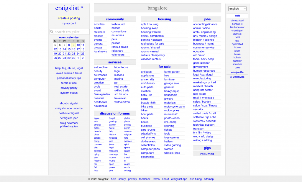
Craigslist Bangalore
This popular classified website is meant for posting ads of all kinds. Personal ads, hiring calls, buying and selling of goods, real estate and property-related ads are some of the most popular categories.
It gets a huge huge amount of traffic, however, despite being popular, the design remains outdated and irrelevant. It lacks visual appeal, doesn’t effectively use screen space, giving a very cluttered and scattered impact, which makes browsing and finding what you are looking for very tedious.
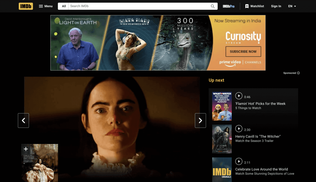
IMDB
This is an online database of entertainment content. Here users find information related to movies, films, TV series, actors and other cast related information. The current layout tries to mimic the style of popular OTT platforms. This is suitable for viewing the video content, however the information that is text-based and archived, such as information related to movies/films, shows, cast and production, becomes very difficult to browse and search. This is a deviation from the original purpose this website served.
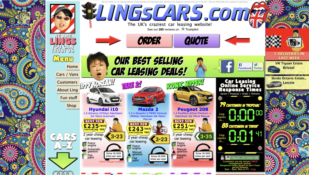
Lingscars
This is a car leasing website based in England and this website appears on almost all lists of worst website designs of all time. It has all the makings of a web presence that is loud, garish and uninviting, with unwieldy navigation, zero information architecture and unfortunately comes off looking like a website aimed at scamming or phishing.
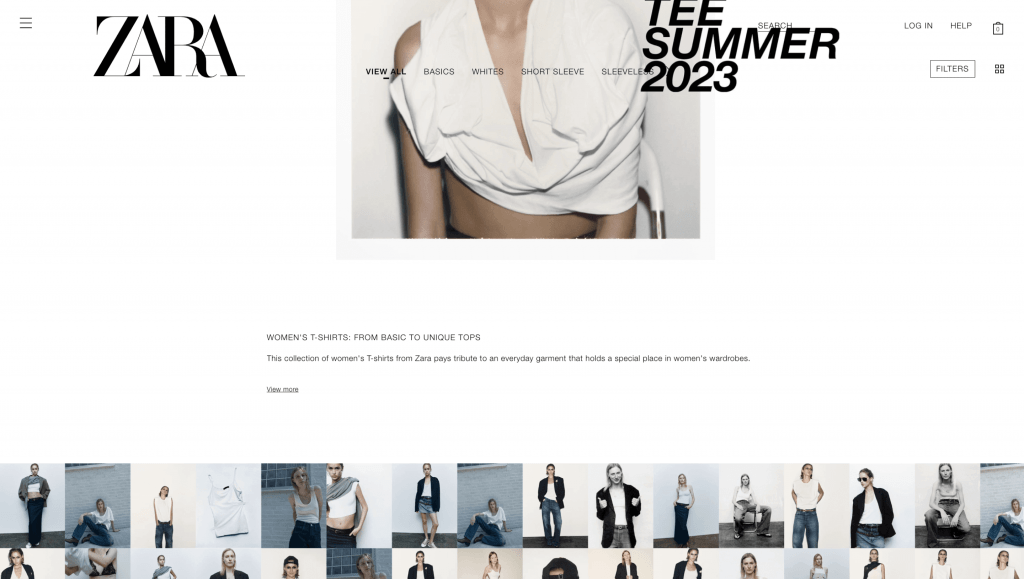
Zara
Despite being a popular, trendy high-end brand with a global presence, the website delivers a very poor user experience. Too-large images, an altogether missing primary navigation bar on the Homepage, unwieldy text in capital letters make it really hard to navigate and find what you’re looking for.
Fashion images overlaying the navigation bar on the inner pages, looks amateur and unfinished.
News18
One of India’s premier news broadcast networks, this website puts a poor face on the web. Not only is it very cluttered with no thought given to information hierarchy or readability, it is also cramming too much content within small containers. This makes the fonts look misaligned in many places. A confusing smattering of too many links leads the eyes in multiple places and doesn’t deliver impactful news as one expects. Overall it isn’t very reflective of the brand that a news site like this should aspire to.
Please check again–this is general format for all news sites
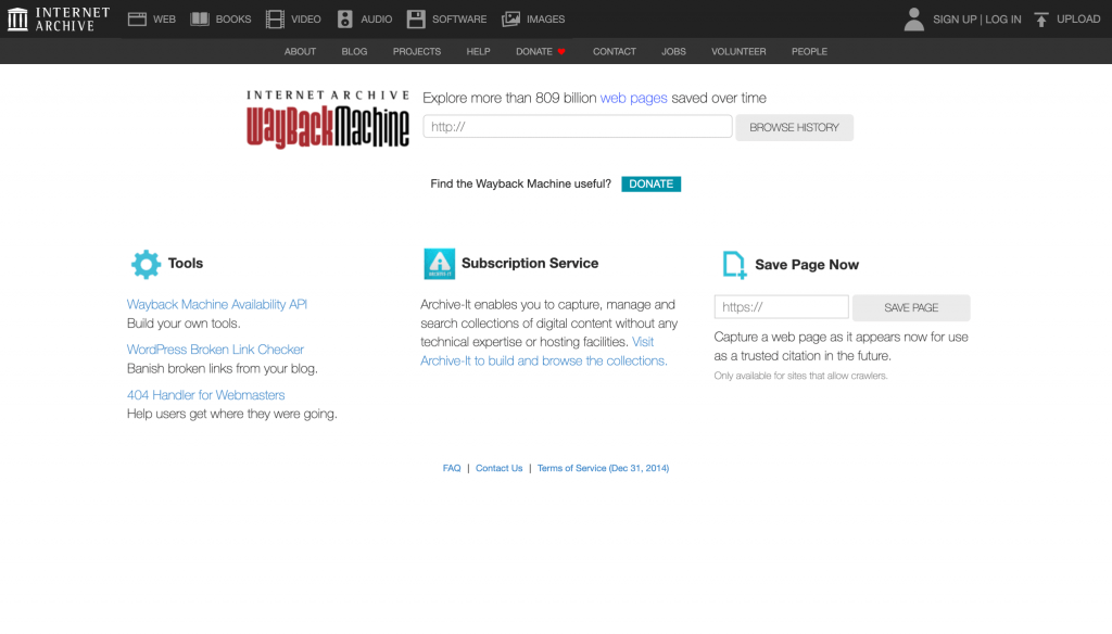
Archive.org
Archive is a digital library that provides access to books, music, and movies and more importantly is a repository for all kinds of content that was once on the internet but may have been taken down since. It is a significant resource, let down by a poor and outdated interface design. I have to say that although it is easy to navigate, with everything visible upfront, the visual style and vocabulary used hasnt been updated since the early 2000s, which is probably when it was designed.
The inner pages have an improper margin between the image placeholders, the left side menu is unwieldy and too long. There is no intelligent information architecture and fonts used across the site are imposing. This makes it difficult for the eyes to capture important information first and be led to secondary and tertiary information.
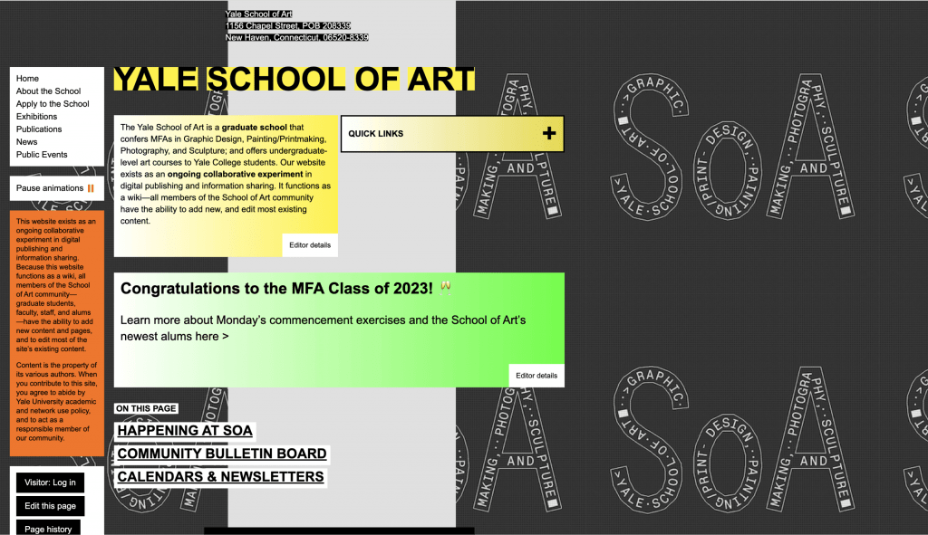
Yale School Of Art
When a prestigious arts college has such a chaotic and confusing web presence, it makes you wonder if it’s a way to get noticed amongst the art and design audiences that will be visiting the site. Everything from the typography to visuals, poor colour choice, random incohesive backgrounds and the navigation doesnt work in favour of a good browsing experience.
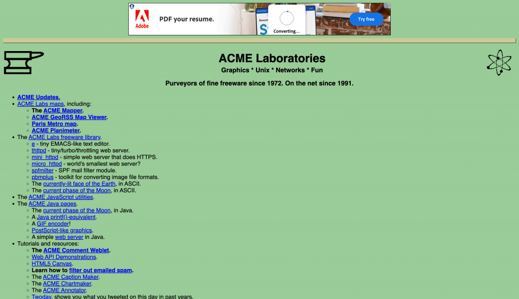
ACME
This website is a library of some of the most useful freeware available on the net. Yet, because of its terrible design, it is not very user-friendly or inviting for someone to find what they may be looking for. The overall look is “undesigned” almost like there was absolutely no effort or time spent in trying to design this site to be a useful repository. The homepage has a header without a separator and two icons floating at the extreme ends on either side of it, one of which is a gif. Following this is a long vertical list of hyperlinks that are not efficiently categorised or spaced out such that users may find thematic distinctions which could make browsing easier. The single green background colour is also not appealing or user friendly, in addition to the zero differentiation between the header, body, and the footer.
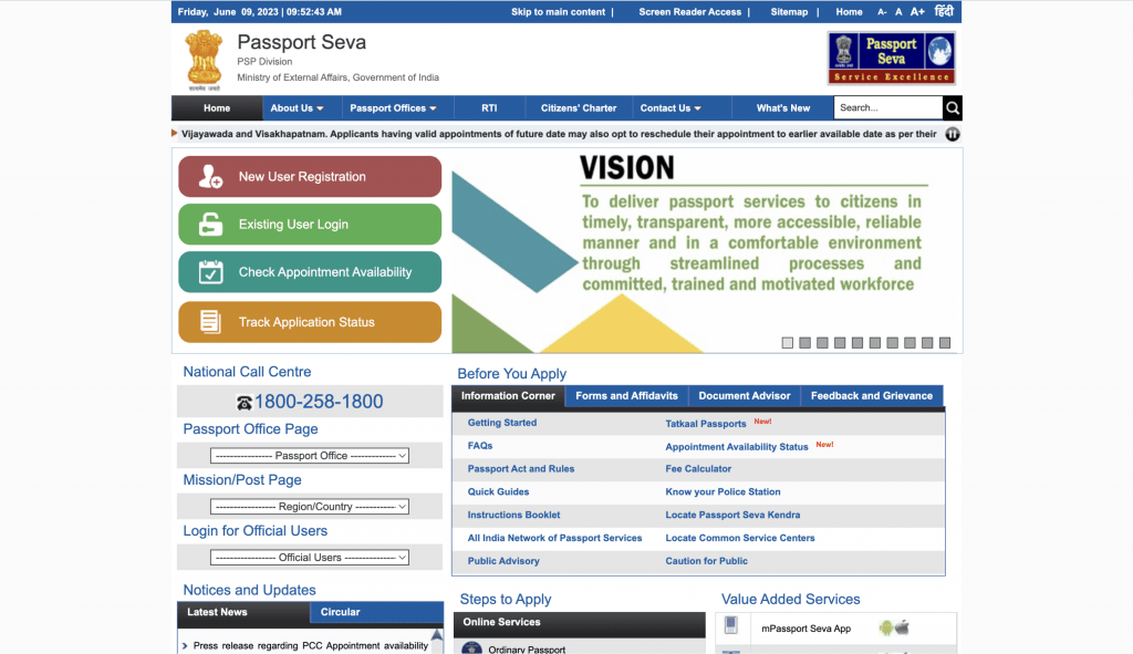
Passport India
The process to procure a passport may have improved by leaps and bounds, but the website that is the primary house for all the information, forms and processes around this still has an outdated, difficult to navigate and unimpressive look. An old-style navigation bar, inconsistent buttons, misplaced search box, unwieldy dropdowns and very basic, careless design errors such as blurry icons, substandard font selection, outdated banner design, make this such a disappointing website, given the important function it plays. Little to no margin or separation between boxes makes the overall look and feel congested, visually as well as from an information point of view.
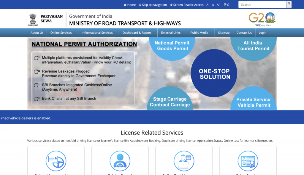
Vahan Parivahan
This is the online presence of the Ministry of Road Transport and Highways of India, and it sports a very old-style navigation bar with a large list of text/content under the dropdown. At first glance this is such an outdated and unsophisticated look for this kind of a website. In addition, it also has poorly designed banner images and landing pages that have no clear CTAs. Content caters to certain distinct categories, but hasnt been sorted or presented in a way that makes it intuitive or obvious to the user. One has to scroll and scroll like searching for a needle in a haystack, making this a very stodgy and untidy experience.
Even at a time when we have so many wonderful website building tools, libraries of effective templates and the like, there are scores of sites out there that seem like they’ve been designed after first throwing all design principles out the window. However, I want to state that the intention is not to poke fun at any of them, rather to critically inspect them and learn from the errors made by others, with an interest to do better.